The deductible was there. GEICO made me earn it.
About a 3 minute read
I needed one fact about my own account: the deductible. The product had the answer the whole time. The path to it ran through policy summaries, slow loads, a dashboard that warned me about its own data, a search that didn't know my account, and finally a change-coverage flow. All that for a number I was nervous to touch by the time I found it.

What I was trying to do
Find the deductible on my auto policy. A lookup. Thirty seconds of my day, ideally, with nothing changed and nobody called.
Insurance pages already carry a charge. People checking a deductible usually have a reason, and sometimes the reason is sitting in a dented car in the driveway. A fact that simple should never feel like paperwork, least of all during the worst hour of someone's week.
Where the flow fought back
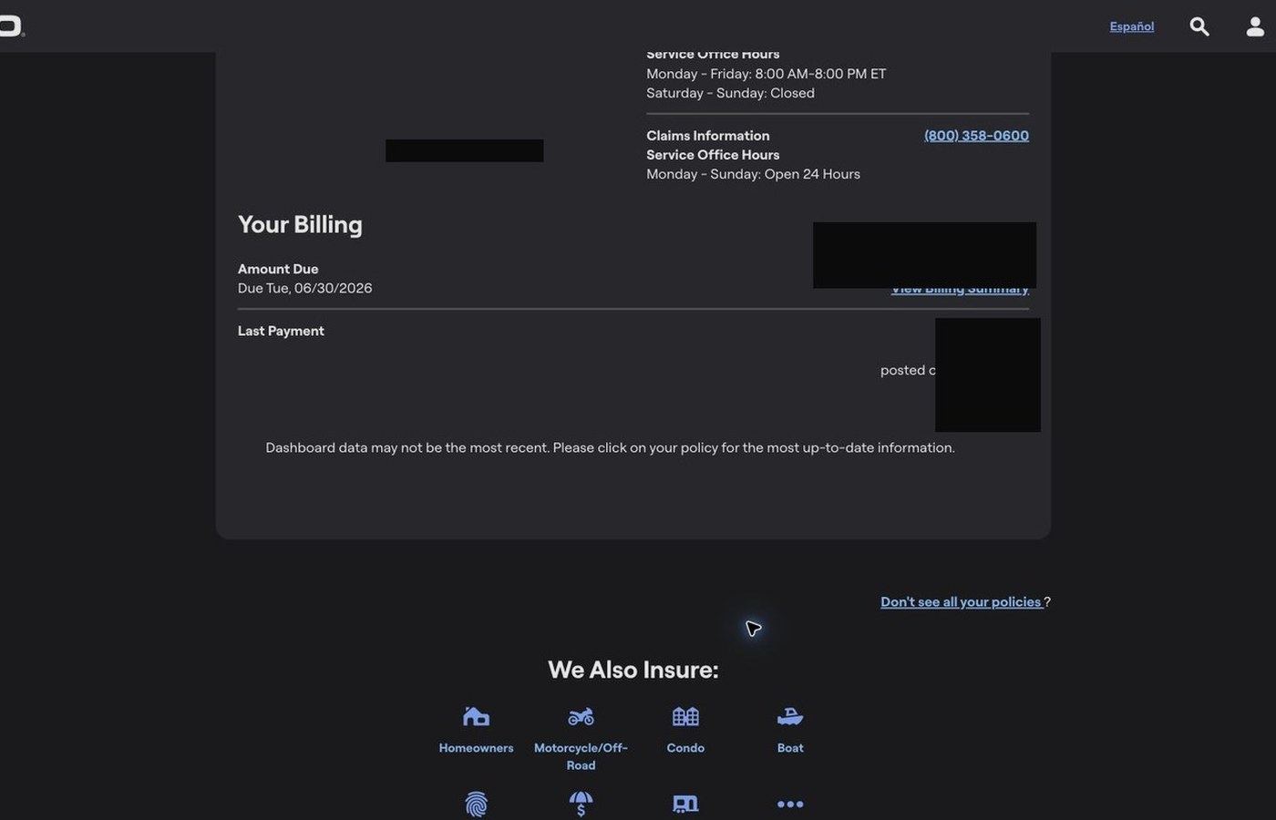
The dashboard showed policy information but not the deductible. The policy page didn't answer it either. Search sounded promising, then failed as an account shortcut. The answer finally surfaced inside an edit and change-coverage area, which is precisely the doorway a careful customer avoids, because nobody wants to change their insurance while trying to read it.
- 01
The dashboard skipped the fact people come for. A deductible is one of the most-checked numbers in insurance, and the summary didn't carry it.
- 02
A read-only errand was routed through edit language. "Change Coverage" made looking feel like touching. I hovered over that link longer than I'd like to admit.
- 03
Every wrong turn charged a toll. Loading screens broke momentum after nearly every meaningful click, and each wait erased a little of my mental map.
- 04
Search didn't know my account. Typing "deductible" into the product that holds my deductible got me articles instead of my answer.
- 05
The dashboard warned me about itself. It said the data might not be current and pointed me deeper, which is a strange thing for a front door to do.
Why it matters
The interface made me wonder whether looking at my deductible was step one of changing it.
That is a trust problem. Users live in the words, and the words here say edit. A customer should never have to deduce that "change" is also where "current" lives.
The slow loading turned a flaw into a tax. One wrong click meant losing the map, watching the logo, and trying to recall whether the last page was closer to the answer or further from it. People do this on phones, in parking lots, after accidents. The clock matters.
What I would change first
- 01
Print the deductible on the policy summary and the vehicle coverage summary. It belongs on the label.
- 02
Split "view coverage details" from "change coverage." Safe reading deserves safe words.
- 03
Teach account search the account's own facts: deductible, premium, ID card, due date. Those four queries are probably half the traffic.
- 04
Give loading screens a destination: "Opening vehicle coverage." Tell people where they're going while you make them wait.
- 05
If dashboard data can be stale, show its timestamp and link straight to the live source. A warning without a door is just anxiety.
The larger pattern
A thirty-second errand got treated like a policy-management workflow, and that is the whole finding. People will absorb plenty of complexity while doing genuinely complex work. Aim that same complexity at a small job and it reads as risk: now looking at my own number feels like a thing I could get wrong. Reading should never feel like editing. On this flow, it did.